3 years ago
Box Art History #3: Fairchild Channel F
Before the NES, before the Atari 2600…
Fairchild’s Channel F was the first video game console to run games directly from a cartridge. While Magnavox’s Odyssey had game cards that …
Read More
 4 years ago
Box Art History #2: Computer Games Played On Paper
Early computer game history often gets overlooked.
Maybe it’s because “computer games” used to be considered different from “video games,” back when “video” was defined by the presence of a …
Read More
 4 years ago
Box Art History #1: Magnavox Odyssey
“Don’t judge a book by its cover,” the saying goes.
This age-old idiom originally meant you shouldn’t judge a person by their shabby clothing. But in a literal sense, I …
Read More
 11 years ago
By Its Cover: The Worst Box Art Of 2012
Now that we’ve done the best, it’s time for the worst. Most “worst box art” round-ups just post a bunch of funny-looking covers that lend themselves to a single sentence of snarky commentary. But not this one.* Our list aims to point out box art that’s bad from a design perspective, and attempts to explain why.
*On the other hand, if you were funny-looking images with snarky commentary is what you were looking for, there’s also a little of that at the end of the article. Read More
 11 years ago
By Its Cover: The Best Box Art Of 2012
Welcome back to the only annual box art round-up that attempts to explain why each image is successful from a design perspective. They say you shouldn’t judge a book (or …
Read More
 12 years ago
The Absolute Best Box Art Of 2011
We’ve covered the worst box art of the year, now it’s time to look at the best. An effective videogame cover does two things: it stand out on a shelf next to other box art, and it gets across the general tone or concept of the game. The following covers are ones that I think accomplished this in the most stylish and eye-pleasing way. Read More
 12 years ago
The Absolute Worst Box Art Of 2011
Every year, several sites feature their own article about the worst videogame box art of the year. But often times the box art featured actually bad designs, so much as …
Read More
 13 years ago
By Its Cover: Mass Effect – A Trilogy Of Bland Covers
It’s said you should never judge a book by its cover. But the simple fact is that we all do it. We can’t help ourselves.
The job of a cover …
Read More


Infographic: Wii U Has More Metroid Games Than Any Other Console
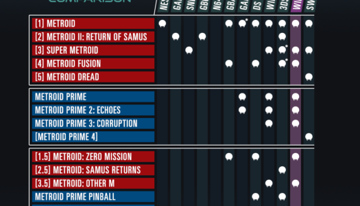
To mark my Patreon reaching its first 50 patrons, I decided to create another infographic! This time the subject is “Which Platform Has The Most Metroid?,” a backwards compatibility comparison. …
Read More
Metroid’s Justin Bailey Is A Real Person; Here’s Why He Hasn’t Spoken Up
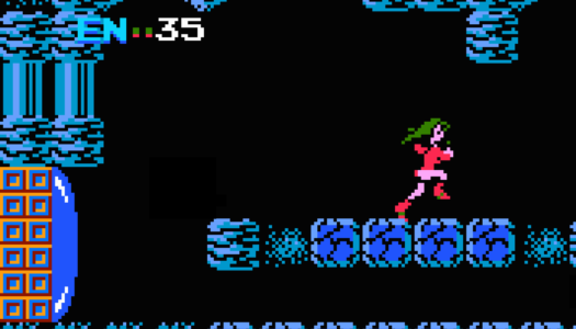
“Justin Bailey” is one of the most famous secret codes in the history of gaming.
Sure, it’s not as well-known as the Konami Code, but for anyone who becomes interested …
Read More
Make Love Not War: Talking With The Creator Of The First Software Easter Egg
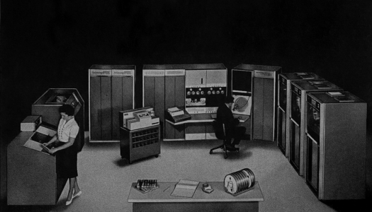
William Weiher created the first software Easter Egg circa 1968, but didn’t realize it until I told him.
Last month, I revealed the previously forgotten oldest Easter Egg in a …
Read More
Moonlander: One Giant Leap For Game Design
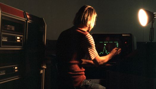
Everyone knows Neil Armstrong was the first man on the Moon, but who was the first man in a video game?
Early video game history is littered with “firsts” — …
Read More
Box Art History #3: Fairchild Channel F
Before the NES, before the Atari 2600…
Fairchild’s Channel F was the first video game console to run games directly from a cartridge. While Magnavox’s Odyssey had game cards that …
Read More